Apple’s iOS 9 software update makes iPhone more efficient
iOS 9 might not seem like much of a huge improvement at first glance, but Apple’s developments in this new update, released Sept. 16, actually add much more to the efficiency of using the iPhone. Many of the developments are new and helpful features, while some were just desperately needed even before this update. And hey, its bulk of storage that the software update takes up has been packaged smaller as well to 929 MB, so I don’t feel as if the new improvements will take place of future selfies.
As for the new improvements, the iPhone has finally become smarter, cleaner and more efficient. Many of the small developments make getting what I want out of my iPhone truly easy. With an easy swipe to the left from the first home screen, there is a fully developed search bar that searches our whole phone with a couple key clicks. And as the phone becomes smarter, it quickly recognizes our favorite apps and delivers them under the search bar. Users can also reach the same more advanced search by pulling down as well. Also, if we reach one app from going to another, a small option appears at the top left screen, asking if we would like to return to the original app. I find that I’ve used this the most out of all the improvements on iOS 9.
Although some of these improvements had me at “Wow,” some of these developments were making me say “Thank god they finally did it.” Some of these updates were needed so much that Apple looked bad without them. Low battery mode is something iPhone’s desperately needed, because with its battery gone in minutes reputation, the iPhone needed a way for people to take a breather. They also claim that the battery was fixed even more, but they said that about the iPhone 6, so who can tell if it is really fixed. The main thing is that we can actually see our battery sustaining through Low Battery Mode. News was also something desperately needed. It’s not like most people want to know about what is going on in the world, right? Finally we don’t have to switch on a TV in order to find out.
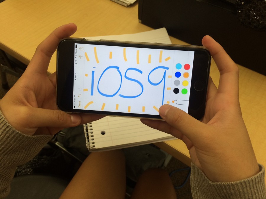
Now one of the things that most people recognize at first is the notes abilities such as drawing and sketching and new multitasking screen that is now overlapping your recently visited apps rather than showing them side to side. Honestly, not much of an opinion about this, and I don’t believe it makes quite much of a difference actually. Usually the design is what catches the eye first, but with this update it’s all about efficiency, which is what Apple should have developed a while ago. And although it may be fun to take out a stylus or exit our recent apps faster, getting to our app or information as quickly as possible is a new experience Apple has finally developed to its fullest.
UPDATE: I regret typing this because three days after my mainly positive review my phone crashed, the screen blacked out and my phone received an immense amount of glitches. These glitches have affected my phone in more ways than one, including my apps crashing, apps clearing data, and at worst blacking out my phone’s screen. This was and still is extremely inconvenient, and now I am at the point where I have to restart my phone by holding the home and the lock button down until it restarts. Even if this was an amazing update, it was NOT worth the glitches.
Apple has admitted to these issues and has released two new updates; the 9.0.1 on Sept. 24 that specifically was aimed towards fixing these issues and then the 9.0.2 on Oct 1. Although I was hopeful, I have not seen improvement on these issues regarding my phone’s efficiency and it is very frustrating.
by RACHEL MARQUARDT


![On the stage, Daniel Bozinovski and Rachel Treto play their part as Tom and Hannah in the show “The Cast List”. The show was about a group of students who were told about their cast list for the play “Romeo and Juliet.” The Theater I students were in preparation for their first showcase of the year. Students went over their lines during all of their class for the past two months. “[We put in] a lot of rehearsal, practicing lines, making sure you have everything memorized and making sure you are ready to go in and not forget anything,” Nathan Weeks said. Photo by Megan Kubas.](https://www.whitneyupdate.com/wp-content/uploads/2024/05/IMG_4085-600x396.jpg)
