Students customize app icon with Instagram’s new update

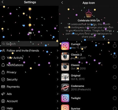
To celebrate Instagram’s 10-year anniversary Oct.6, the app introduced a new feature to let users change the icon.
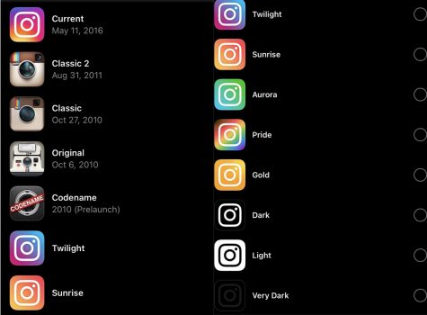
The app lets users choose from 13 different icons including their original logo in 2010 to a variety of color schemes. In the app anyone can go under settings, swipe up where confetti will appear and a new screen will appear showing users the new options.

Students enjoy this update because it allows them to select based on their individual likings. Original Instagram users switched back to the classic camera-themed app icon.
“I like the update with the new icon feature because the older icons, like the Classic one lets me reminisce on the old times when I first got Instagram and social media just wasn’t as big of a deal,” Kloe Kelly said.
Other students chose based on their favorite color.
“I like the new Sunrise icon because those are all of my favorite colors combined, so I will be constantly drawn to the app since it also matches my background,” Ali Keyes said.
The new feature also allows students to coordinate the app icon with their newly designed iOS 14.0.1 update, making it pleasing to the eye.
“The ‘very dark’ is my favorite one because now more of my apps go together with my homescreen. It definitely confused me at first because I’m used to looking for the colorful logo so the all black icon threw me off, but I really like it now,” Evan Prudhoe said.
For students who like to keep their phone simple, they stuck with the simple color-themed icons.
“After school one of my friends, Cody Johns, came up and showed me the icons. I switched it to the light one because I thought it looked really clean and fresh, also it goes with my widgets with the new [iOS 14.0.1] update,” Mason Ball said.
by KATIE LOMBA & CHLOE PRUDHOE


